BRAND REFRESH LAUNCH
We’re delighted to announce the latest evolution of our brand, a fresh and creative new look for the New Year!
Logo
![]()
Our previous logo was vibrant and bright, with a very recognisable shape and distinctive ‘radius dot’ pattern. However, we found it tricky to place on most backgrounds apart from black or dark grey which limited its flexibility.
We wanted to retain the overall appearance whilst upgrading the font and colour palette to give a more modern, forward-looking feel.
Our upgraded logo moves the ‘radius dot’ pattern to the left-hand side with a slanted swirl to indicate forward movement.
Monogram
 We’ve also created a monogram for more self-contained elements such as social media, our ‘web-chat’ console and where a watermark may be necessary to protect IP.
This fits perfectly into a circular or square space and retains the same overall look and feel as our primary logo. It works just as well in colour as it does reversed-out on a coloured background.
We also use this monogram where the context is already established as being distinctly related to Newton Print so as to minimise disruption.
Colour Palette
Our upgraded colour palette has a primary range of ‘strong pastels’ which give a nod to the vibrance of printed media. We also have a secondary range of softer pastel colours included to balance out the strength of the primary colours where necessary.
Typefaces
We decided on the Museo Sans Rounded range of fonts for our refreshed brand, a modern sans-serif font that works just as well as a classy heading as it does within professional, easy-to-read body text. We’ve used two strengths within our logo to differentiate the Newton from the Print.
We also have a secondary font for highlights, a more script-style font by name of DK Mandarin Whispers. This font enables us to add a more fun and outgoing element to imagery and brand assets.
Typographic Assets
We have included a collection of hand-drawn style assets to allow for highlighted annotation over images, especially on the website. These will be used to create decorative but useful call-outs and explainer messages.
Image Treatment
Photography is hugely important to us, especially on our online presence, to highlight the quality and diversity of our work. We’ve set up guidelines for all product photography which includes using two-tone and three-tone backdrops in any of our brand colours, as well as marble, concrete and paper textures where relevant.
These guidelines also give us license for creativity, shooting from unusual angles to create a geometric background. As well as this, we experiment with close-up shots to highlight textured paper and print finishes.
Icons
We’ve also introduced icons to clearly communicate our core values. These icons use two of the brand colours and have been created specifically for our online presence.
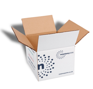
Packaging
Our famous branded packaging has also had an upgrade, using the new logo style and colour palette.
We hope you like it!